Navigating the canvas
Pan
Click and drag on empty canvas, or hold Space and drag from anywhere.
Zoom
Scroll with the mouse wheel or pinch on a trackpad. Use the + / − controls in the bottom-left to zoom in fixed steps.
Fit to view
Click the fit-to-view button in the canvas controls to frame all nodes in the current viewport.
Minimap
The minimap in the corner shows your full workflow and highlights the current viewport. Click anywhere in the minimap to jump there.
Working with nodes
Selecting nodes
- Single-select — click a node.
- Multi-select — hold
Shiftand click each node, or click on empty canvas and drag a selection box around them. - Deselect — click any empty area.
Backspace / Delete.
Moving nodes
Click and drag any node to reposition it. When you release, the new position is saved to the workflow automatically — there’s no “save” button for layout. Multi-select and drag to move several nodes together.Connecting nodes
Each node has handles on its sides — input handles on the left, output handles on the right. Drag from an output handle to another node’s input handle to create an edge between them. Release outside any handle to cancel.- Nodes with multiple outputs (like If-Else or Router) expose labeled handles — you’ll see
true/falsefor If-Else, and your custom labels for Router. - Merge nodes accept multiple incoming edges so you can fan several branches back into one path.
Editing edges
Click any edge to open the Edge settings panel on the right. For edges coming out of If-Else, Router, or other conditional nodes, this panel exposes the condition that gates whether execution follows the edge — including the full mention-based expression editor. Regular edges have minimal configuration (mostly a label).Deleting nodes and edges
Select any node or edge and pressBackspace or Delete. The Manual trigger cannot be deleted — every workflow needs at least one entry point.
Canvas controls
The bottom-left of the canvas hosts a small toolbar with four controls:| Button | Action |
|---|---|
| 🧹 Auto-layout | Re-flows all nodes into a clean, left-to-right layout. Safe to click — you can always undo. |
| ↶ Undo | Step back through diagram edits: node adds, moves, deletes, edge changes. Disabled when there’s nothing to undo. |
| ↷ Redo | Step forward after an undo. Disabled when there’s nothing to redo. |
| ➕ Zoom / fit | ReactFlow’s standard zoom and fit-to-view controls. |
Undo and redo operate on canvas structure only — node positions, edges, sticky notes, node additions and deletions. They do not undo content changes inside a node’s settings panel; those persist as you type.
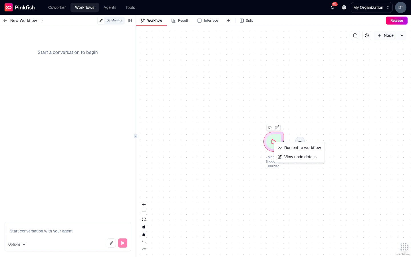
The right-click menu
Right-clicking a selected node opens a context menu with quick actions:- Run until this node — runs the workflow from its trigger up to (and including) this node, then stops. Useful for iterating on a specific step.
- Run entire workflow (on trigger nodes) — fires the workflow from this trigger.
- Add node to the chat context — piles the node into the Coding Agent Chat’s context so your next prompt references it directly.
- View node details — opens the node’s settings side-panel, same as a double-click.
- Delete — removes the node. Disabled for the Manual trigger.
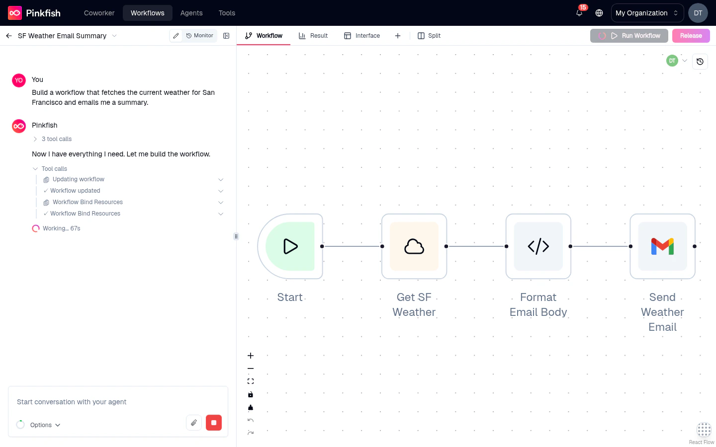
Node status indicators
While a workflow runs, every node displays its live status via color and iconography:- Pending — gray outline, waiting to run.
- Running — animated pulse on the node border.
- Success — green checkmark badge in the top-right corner.
- Error — red exclamation badge; click to open the error in the Log tab.
- Skipped — dimmed with a slash badge when the node was bypassed (for example, the “false” branch of an If-Else).
Hover actions
Hovering over a node reveals a small menu with shortcut buttons — typically Run, Open settings, and Delete. The hover menu is a faster path for the most common actions without needing the right-click menu.Collaborating on the canvas
When two or more teammates open the same agentic workflow, the canvas automatically switches into collaborative mode. No setting to toggle — if anyone else is in the editor, you see them.Avatars
A group of avatars appears in the editor header showing who else is in the workflow right now. Up to four avatars are visible at once; any additional collaborators are grouped behind a +N pill you can hover to see the full list. Each avatar is color-coded per user, and the same color is used for that person’s cursor on the canvas. When a collaborator becomes idle (no mouse or keyboard activity for about two minutes) their avatar fades to half opacity.Live cursors
Every other collaborator’s cursor is rendered live on the canvas, labelled with their name and tinted with their avatar color. Cursor updates are throttled to stay smooth even with many collaborators in the same workflow.Real-time node dragging
When another user picks up and drags a node, the node’s position updates in real time on your canvas. This makes it easy to follow along while a teammate rearranges the graph during a pairing session.What is and isn’t shared
- Shared in real time: cursor position, node positions while being dragged, idle/active status, and each collaborator’s name, avatar, and color.
- Not shared in real time: selections, node edits, settings panel content, sticky-note edits, canvas pan/zoom, and chat messages. Each user has their own view of these.
Requirements
- The feature is agentic editor only — the guided editor does not surface presence.
- Collaborators must be authenticated members of the organization that owns the workflow.
- Read-only viewers count — people who can open the workflow appear on the canvas even if they cannot edit it.
What’s next
Adding nodes
Open the Add Node panel and pick from Nodes, Triggers, and Interface tabs.
Node types reference
The full catalog of executable and control-flow nodes you can place.
Sticky notes & canvas colors
Annotate the canvas and customize its background.
Running a workflow
Kick off a run from the canvas or chat, with inputs, batch mode, or a trigger.