Documentation Index
Fetch the complete documentation index at: https://docs.pinkfish.ai/llms.txt
Use this file to discover all available pages before exploring further.
What can you do with it?
Create interactive data visualizations using D3.js. Generate complete HTML applications with charts, graphs, and custom visualizations based on your data. Perfect for visualizing sales trends, analyzing customer behavior, monitoring KPIs, creating executive dashboards, and presenting financial analysis.How to use it?
Basic Command Structure
Parameters
Required:-
data- The dataset to visualize (can be provided or described) -
visualization type- Type of chart (bar, line, scatter, pie, etc.)
-
title- Chart title -
axes labels- X and Y axis labels -
colors- Color scheme preferences -
interactive features- Hover effects, tooltips, animations
Response Format
The command returns:Examples
Basic Usage
Advanced Usage
Specific Use Case
Notes
Generates complete, standalone HTML files. Uses D3.js v7 for modern browser compatibility. Includes basic styling and hover effects. Code is optimized for token limits (simplified for complex requests). All JavaScript uses ES5 syntax for maximum compatibility.Simple Examples
Time Series Analysis
Comparative Analysis
Distribution Analysis
Part-to-Whole Analysis
Advanced Examples
Multi-Metric Dashboard
Interactive Business Analysis
Complex Time Analysis
Hierarchical Data Visualization
What Can D3 Do?
D3 offers an extensive range of visualization capabilities suited for business analytics. See documenation here: https://d3js.org/what-is-d3 and an amazing interactive example here: https://observablehq.com/@d3/galleryStandard Business Charts
- Line charts for trend analysis
- Bar charts (vertical, horizontal, grouped, stacked)
- Pie and donut charts for composition analysis
- Area charts for cumulative trends
- Scatter plots for correlation analysis
- Bubble charts for multi-dimensional data
Advanced Visualizations
- Heat maps for performance matrices
- Tree maps for hierarchical data
- Sunburst diagrams for multi-level breakdowns
- Network graphs for relationship mapping
- Sankey diagrams for flow analysis
- Radar charts for comparative metrics
- Box plots for statistical distribution
Interactive Features
- Zoom and pan capabilities
- Interactive tooltips
- Click-through drilling
- Dynamic filtering
- Animated transitions
- Real-time updates
- Cross-chart filtering
- Custom legends and annotations
Business Intelligence Features
- Trend line overlays
- Moving averages
- Statistical annotations
- Threshold indicators
- Forecast projections
- Confidence intervals
- Outlier detection
- Benchmark comparisons
Layout Options
- Multi-chart dashboards
- Responsive sizing
- Custom color schemes
- Corporate branding integration
- Export capabilities
- Mobile optimization
- Accessible design features
Tips for Best Results
- Be specific about your data source and desired metrics
- Specify any required filtering or data transformations
- Include desired interactive features in your command
- Mention any specific styling or branding requirements
- Indicate if you need specific annotations or overlays
Saving and Sharing Your D3 Charts
You can save and share your D3 visualizations in two simple steps:- First, create your visualization in one step.
- Then, save it to global file storage in a subsequent step.
- Include visualizations in presentations
- Share insights with stakeholders
- Embed charts in internal documentation
- Archive important analytical views
- Collaborate on data analysis
Iterating
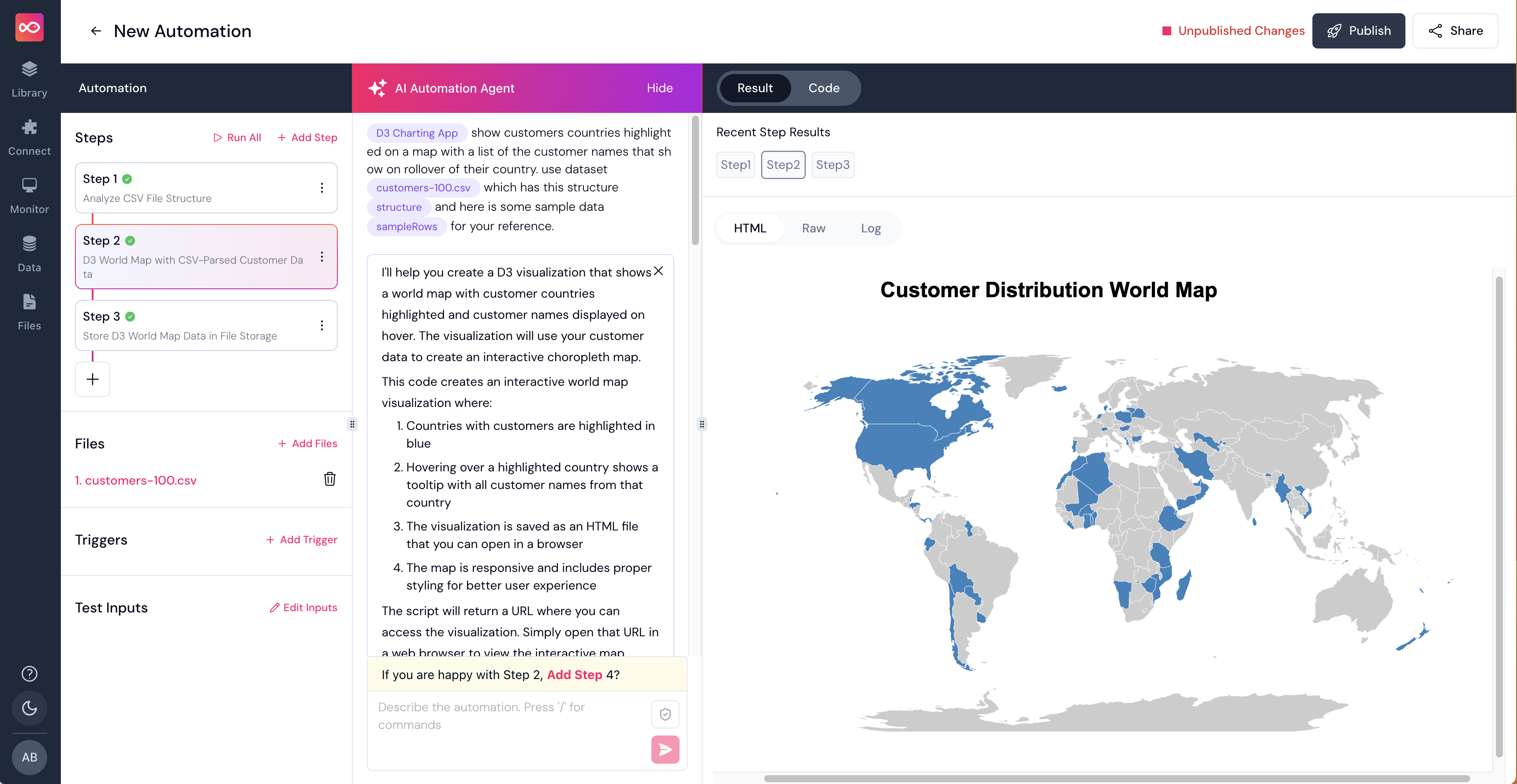
When you get into complex datasets and visualizations, Pinkfish may not get it right the first time. In these cases, you’ll need to have a conversation with Pinkfish to get it right. Here’s an example where I used a CSV with customer data and asked Pinkfish to display customers on a map. It took a few iterations to get it right.