> ## Documentation Index
> Fetch the complete documentation index at: https://docs.pinkfish.ai/llms.txt
> Use this file to discover all available pages before exploring further.
# Interface Builder
> Give your workflow a user-facing form — inputs, confirmation, and results — without writing a line of frontend code.
An **interface** turns your workflow into a tiny web app: a form users fill out, a confirmation screen while the workflow runs, and a results page that shows the output when it's done. Each workflow can have **at most one** interface node — the editor enforces this.
The interface is authored inside the **Interface tab** of the right pane. You see a live preview of exactly what users will see.
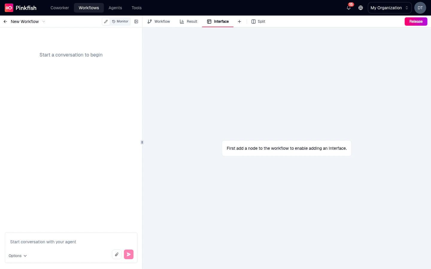 Before adding an Interface, your workflow needs at least one executable node. A brand-new workflow with only the Manual trigger shows the "First add a node" prompt above — add an MCP tool or Code Block first, then the Interface tab becomes editable.
## Adding an interface
1. Open the **Add Node** panel (top-right of the editor).
2. Switch to the **Interface** tab.
3. Click the **Add Interface** card.
An **Interface** node appears on the canvas, wired as a trigger. The **Interface** tab in the right pane becomes active so you can start building the form.
You can only set up one interface. Delete the interface node to create a new one.
## The three views
An interface is a mini funnel with three pages. The control bar at the top of the Interface tab lets you switch between them while authoring:
What the user fills out to start the workflow.
Shown after submit while the workflow runs (or forever, for fire-and-forget).
Renders the workflow's designated output when the run completes.
### Form view
The form is where users provide input. Fields you add here become the trigger's input schema, so downstream nodes can reference `{{trigger.}}` anywhere.
Field types include:
* **Text** (single and multi-line)
* **Number** / **Integer**
* **Email** / **URL**
* **Boolean** (checkbox or toggle)
* **Date** / **Datetime**
* **Select** (single) and **Multi-select** from an enum
* **File upload**
* **Object** and **Array** for nested structures
Each field supports labels, help text, placeholders, required flags, and validation (min/max, regex patterns, file-type restrictions).
#### Starting from a template
Click **Choose a template** to see a library of common form shapes — lead capture, feedback survey, bug report, document intake. Pick one as a starting point and edit from there.
### Confirmation view
After submit, the user lands on a confirmation/thank-you page while the workflow runs in the background. Customize the heading, body text, and optional "next steps" or call-to-action buttons. Useful for long-running workflows where you don't want to block the user.
### Results view
The results view renders the workflow's **designated output** — a specific node whose output becomes what users see.
**Designated output picker:** Below the Interface tab is a control that asks *"Which node's output do users see?"* Pick one of your workflow nodes — typically the last one, but it can be any node with a meaningful output.
Results can render as:
* **Plain text / Markdown** — for simple text answers.
* **JSON** — for structured data, collapsible tree view.
* **Table** — for arrays of objects.
* **HTML** — for custom-rendered output from a code block.
* **Download link** — for files produced by the workflow.
## What users experience
When you release the workflow and make it [publicly accessible](/agentic-editor/releases#public-templates), users get a URL that serves the interface:
1. They land on the **Form** page.
2. They fill in the fields and submit.
3. They see the **Confirmation** page while the workflow runs.
4. When complete, they see the **Results** page rendering the designated output.
The interface also works internally — any Pinkfish user with access to the workflow can run it via its interface URL without editor permissions.
## Editing the interface node
Clicking the **Interface node** on the canvas selects it and brings the Interface tab to the foreground. You can't edit fields from the canvas itself — all authoring happens in the tab — but the node visualizes the connection between the interface trigger and the rest of your workflow.
## Removing an interface
Select the Interface node and press `Backspace` or use the right-click **Delete**. The node disappears along with its configuration, freeing you to add a new interface with different fields or a different designated output.
## What's next
The Interface tab is one of five tabs in the right pane — meet the others.
Other ways to start a workflow if a form isn't the right fit.
Publish the interface as a public-facing URL.
Test the interface end-to-end.
Before adding an Interface, your workflow needs at least one executable node. A brand-new workflow with only the Manual trigger shows the "First add a node" prompt above — add an MCP tool or Code Block first, then the Interface tab becomes editable.
## Adding an interface
1. Open the **Add Node** panel (top-right of the editor).
2. Switch to the **Interface** tab.
3. Click the **Add Interface** card.
An **Interface** node appears on the canvas, wired as a trigger. The **Interface** tab in the right pane becomes active so you can start building the form.
You can only set up one interface. Delete the interface node to create a new one.
## The three views
An interface is a mini funnel with three pages. The control bar at the top of the Interface tab lets you switch between them while authoring:
What the user fills out to start the workflow.
Shown after submit while the workflow runs (or forever, for fire-and-forget).
Renders the workflow's designated output when the run completes.
### Form view
The form is where users provide input. Fields you add here become the trigger's input schema, so downstream nodes can reference `{{trigger.}}` anywhere.
Field types include:
* **Text** (single and multi-line)
* **Number** / **Integer**
* **Email** / **URL**
* **Boolean** (checkbox or toggle)
* **Date** / **Datetime**
* **Select** (single) and **Multi-select** from an enum
* **File upload**
* **Object** and **Array** for nested structures
Each field supports labels, help text, placeholders, required flags, and validation (min/max, regex patterns, file-type restrictions).
#### Starting from a template
Click **Choose a template** to see a library of common form shapes — lead capture, feedback survey, bug report, document intake. Pick one as a starting point and edit from there.
### Confirmation view
After submit, the user lands on a confirmation/thank-you page while the workflow runs in the background. Customize the heading, body text, and optional "next steps" or call-to-action buttons. Useful for long-running workflows where you don't want to block the user.
### Results view
The results view renders the workflow's **designated output** — a specific node whose output becomes what users see.
**Designated output picker:** Below the Interface tab is a control that asks *"Which node's output do users see?"* Pick one of your workflow nodes — typically the last one, but it can be any node with a meaningful output.
Results can render as:
* **Plain text / Markdown** — for simple text answers.
* **JSON** — for structured data, collapsible tree view.
* **Table** — for arrays of objects.
* **HTML** — for custom-rendered output from a code block.
* **Download link** — for files produced by the workflow.
## What users experience
When you release the workflow and make it [publicly accessible](/agentic-editor/releases#public-templates), users get a URL that serves the interface:
1. They land on the **Form** page.
2. They fill in the fields and submit.
3. They see the **Confirmation** page while the workflow runs.
4. When complete, they see the **Results** page rendering the designated output.
The interface also works internally — any Pinkfish user with access to the workflow can run it via its interface URL without editor permissions.
## Editing the interface node
Clicking the **Interface node** on the canvas selects it and brings the Interface tab to the foreground. You can't edit fields from the canvas itself — all authoring happens in the tab — but the node visualizes the connection between the interface trigger and the rest of your workflow.
## Removing an interface
Select the Interface node and press `Backspace` or use the right-click **Delete**. The node disappears along with its configuration, freeing you to add a new interface with different fields or a different designated output.
## What's next
The Interface tab is one of five tabs in the right pane — meet the others.
Other ways to start a workflow if a form isn't the right fit.
Publish the interface as a public-facing URL.
Test the interface end-to-end.